Luke Buxton
lukeandrewbuxton.com
This is an online portfolio for Canadian Art director, Animator, and Production Designer, Luke Buxton. This site was built in Django, with Vanilla JavaScript.
What is it?
This is a standalone Django site, built as an online portfolio for Canadian animation designer, Luke Buxton.
Luke pitched an idea for his online portfolio, where his illustrations sat diagonally within a photo of his laptop. It proved to be challenging, but made for a fun site to build and to view.
This project was one of the first in many years where I avoided the use of jQuery (I held to the idea that I might not need jQuery), or any other JavaScript library. I wanted to try to do it completely on my own.
It's got your typical hamburger menu in the top-left, loading animations, and lightbox slideshows. All that, and a backend for Luke to keep his content up-to-date.
Loading Large Images
One of the biggest challenges was figuring out how to manage loading all of the large images Luke wanted displayed.
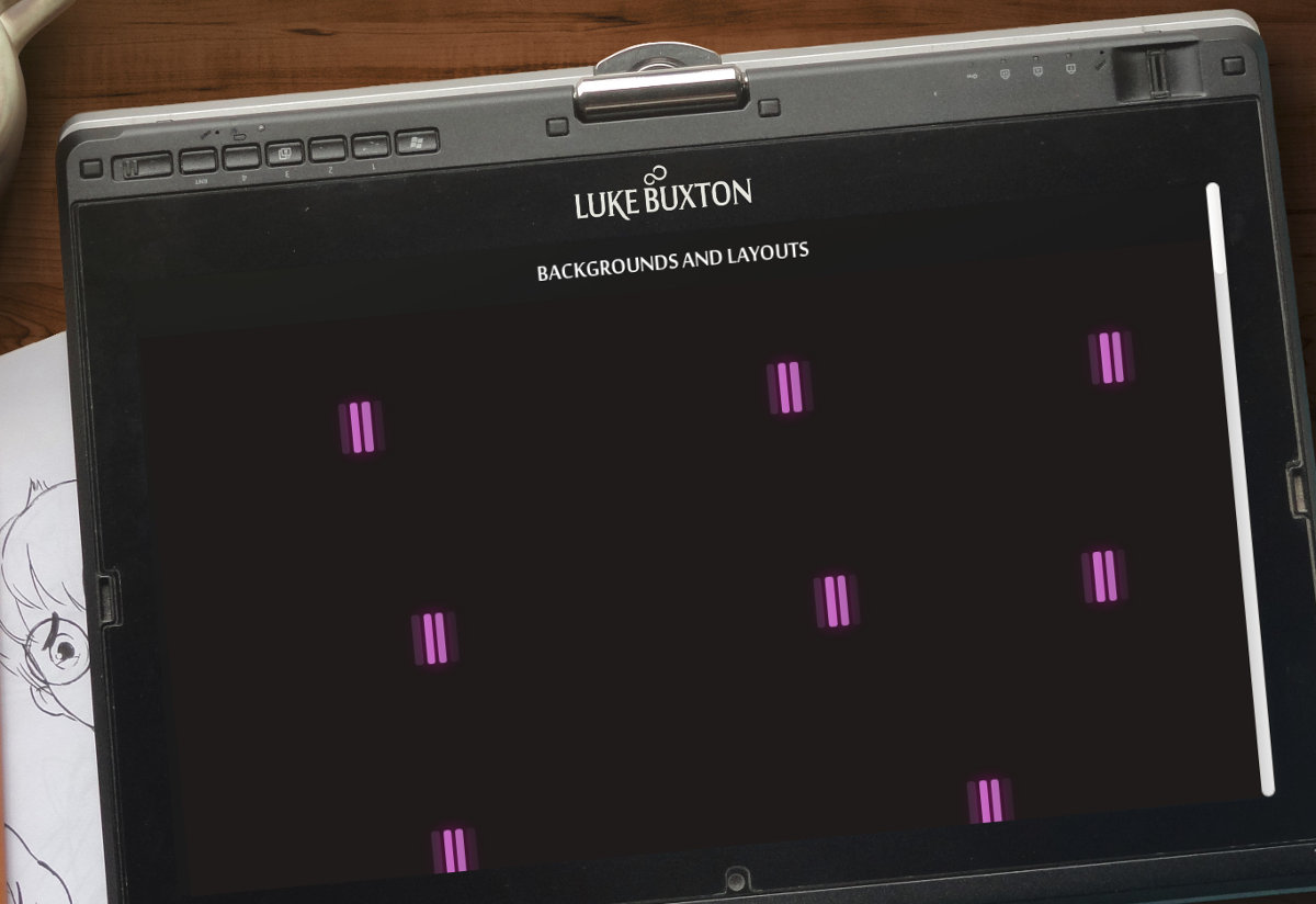
I added a few loaders: an animated one made of pink lines, and a fading splash screen.
Both help to reduce the perceived load time, and make the experience appear seamless: No choppy image loading.
// get splash image
whenImageReady(title_src, function () {
    // fade loader
    fadeOut(load_screen, css_delay, function () {
        // delay title
        window.setTimeout(function () {
            // get body background
            whenImageReady(body_src, function () {
                thumbLoaders();
                // fade title
                fadeOut( title_screen, css_delay );
            });
        }, title_delay);
    } );
});
All of the loading animations are handled with a Loader constructor which simply appends .load-holder and .load-animation elements into any element — the CSS handles the rest.
Putting the Content into the Laptop
The next part of the puzzle was figuring out how to display all of the content as if it were being displayed on the laptop in the background.

First, I positioned the main content exactly inside the laptop screen. I recreated the CSS cover effect in JavaScript: dividing page width and height by predefined static ratios for top, left, width, and height.
window.onresize = function () {
    var width = Math.max(innerHeight * bg_ratio, innerWidth),
        height = Math.max(innerWidth / bg_ratio, innerHeight);

    main.style.left = (width / left_ratio) + 'px';
    main.style.top = (height / top_ratio) + 'px';
    main.style.width = (width / width_ratio) + 'px';
    main.style.height = (height / height_ratio) + 'px';
};
The images in the gallery are flush with the screen (Note: I didn't use flexbox). I assigned each image one unit for portrait, two units for landscape, then divided them into each row (each row has a max of 5 units).
class ArtWork (models.Model):
    title = models.CharField(max_length = 150)
    original_image = models.ImageField(upload_to = 'artwork')

    @property
    def orientation (self):
        image = self.original_image
        if image.width > image.height:
            return 'landscape'
        return 'portrait'

    @property
    def cols (self):
        if self.orientation == 'landscape':
            return 2
        return 1
I iterated the images, counted up each of their unit values, and create new rows once it passed the max of 5 units.
var row = [],
    table = [ row ];
for (var i = 0, len = thumbs.length; i < len; i++) {
    var cols = Number(thumbs[ i ].dataset.cols),
        width = sumArray( row ) + cols;

    if (width > 5) {
        // create a new row
        row = [];
        table.push( row );
    }

    row.push( cols );
}
I could then iterate the rows and calculate the true percentage value of each unit and pass that onto the image.
/*
* [[2, 2, 1], [2, 1, 1]]
* turns into
* [['40%', '40%', '20%'], ['50%', '25%', '25%']]
*/
i = 0;
for (var row = 0, len = table.length; row < len; row++) {
    var _row = table[ row ],
        width = 100 / sumArray( _row ),
        col_len = _row.length;

    while (col_len--) {
        var thumb = thumbs[ i++ ],
            cols = Number( thumb.dataset.cols );

        thumb.style.width = (width * cols) + '%';
    }
}
Finally, the content also needed to be rotated:
main {
  position: absolute;
  transform-origin: top left;
  transform: rotateZ(-5.3deg);
}
And that sums it up! It was a series of challenges that made for a unique look for Luke's portfolio.
Simple Custom Light Boxes
Some simple lightboxes to help view the images in the galleries.
These were custom-built with CSS for appearance, and JavaScript for functionality.
var thumb_i = 0,
    NAV_BUTTONS = {
        37: 'moveleft',
        39: 'moveright',
        27: 'exit'
    };

// keydown scrolls through thumbs
document.addEventListener('keydown', function (e) {
    var nav = NAV_BUTTONS[ e.which ],
        all_thumbs = document.getElementsByClassName('thumb'),
        len = all_thumbs.length;

    // no button pressed
    if ( !nav ) return;

    if (nav === 'exit') {
        if (showcase.style.display === 'block') {
            // hide
            showcase.style.display = 'none';
        }
    } else {
        if (showcase.style.display === 'block') {
            if (nav === 'moveright') {
                // get next thumb
                thumb_i = ((thumb_i + len + 1) % len);
            } else if (nav === 'moveleft') {
                // get previous thumb
                thumb_i = ((thumb_i + len - 1) % len);
            }
            showcaseThumb( all_thumbs[ thumb_i ] );
        }
    }
});
The appearance is merely to be fixed on the screen with a faded backdrop.
#showcase {
  z-index: 1;
  position: absolute;
  top: 0;
  bottom: 0;
  left: 0;
  right: 0;
  background: rgba(0,0,0,0.75);
  display: none;
  cursor: pointer;
}

img#showcase-image {
  position: relative;
  top: 50%;
  transform: translateY(-50%);
  width: 80%;
  height: auto;
}
The #showcase-image element uses a vertical centering trick that I learned from David Walsh. The lightbox opens and closes on click (no exit button) for simplicity's sake.
Ajax Content Loading
Because the whole site content is meant to be displayed on the image of the laptop screen, it was easy to request and load the content separately.
def getPage(request, template, context = {}):
    # if ajax, just get content template
    if request.is_ajax():
        return render(request, template, context)

    # else: render content into the page template
    context['template'] = template
    return render(request, 'page.html', context)

def design(request):
    gallery = get_object_or_404(Gallery, title = "Design")

    # get the whole queryset
    works = gallery.work_set.all()

    context = dict(
        gallery = gallery,
        works = works
    )

    return getPage(request, 'gallery.html', context)
The page.html template has a tag which includes the template passed in getPage. In JavaScript, there is a clientside function that requests the page.
// ajax links
link.addEventListener('click', function (e) {
    var href = this.href;
    e.preventDefault();

    if (href === window.location.href) {
        // don't transition if same page
        return false;
    }

    // callback returns html as responseText
    getPage(href, function (data) {
        window.history.pushState({
            'data' : data,
            'href' : href
        }, '', href);

        // set HTML, and add handlers again
        transitionContent( data );
    });
});
This way the page doesn't need to reload (neither do the loaders or the splash page need to appear again). It creates a speedy, efficient appearance, and helps the user experience.