Alberta Tomorrow
albertatomorrow.ca
A classroom-focused, interactive mapping app designed to make students aware of some of the complexities involved in land-use planning
What is it?
Alberta Tomorrow is an online web and mobile simulator managed by a Calgary-based charity named Alberta Tomorrow Foundation.
Their goal is to provide resources to teachers so that the teachers will be able to easily use the Alberta Tomorrow simulator as part of their curriculum. Their simulator is used by teachers to manage classes, and used by students to visualize changes in their own landscapes over time.
The Web App
The main feature of the app is the simulator, where students can view historic and predictive land-use simulations in 30 different areas of Alberta.
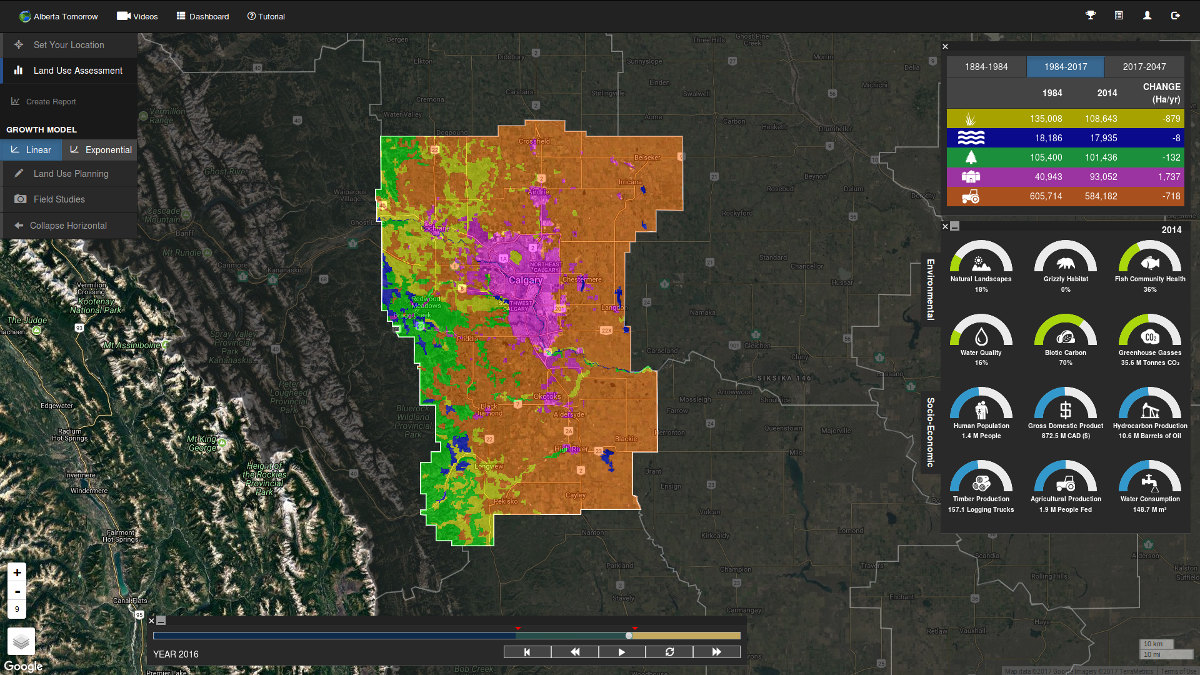
Students can draw their own land-use plans and see how that affects the outputs which indicate land-use wellness: such as water quality, greenhouse gas, and timber production.
The app was moved from Flash and ESRI to JavaScript and PostGIS, with pages served by Django.
I created many of the components on the site, such as its simulator tutorial, event-based awards/badges, and making performant, dynamic gauges for readouts.
Freehand Shapes
Another component of the app is a freehand shape drawing plugin for Leaflet:
I developed this plugin to address a couple issues:
- needed to work on mobile
- needed to be reasonably performant
- needed to be able to have multiple instances
I forked an existing freehand plugin, and then I added touch events, and altered the logic to allow for multiple instances. There were a number of considerations for performance: first, it's done on an HTML5 Canvas. Second, I conditionally added and removed mouse events; for example, the 'mouseup' event is only handled after a 'mousedown' event.
Mobile
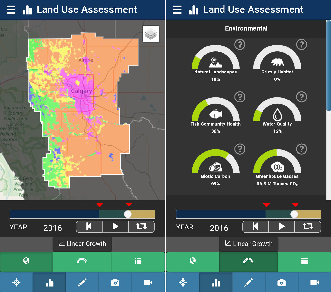
The mobile app was done in Adobe Phonegap. For the most part I copied the JavaScript from the web app over to the mobile app; which was easy to customize because I built the web app to be modular with Browserify.
One of the biggest challenges was adjusting the layout of the web app from a desktop size to a handheld (Note: the web app is not responsive). Here we had to unpack as much of the UI as possible and reimagine it.

For the main nav I had a helper function which handled a title, an icon class, a show function, and a hide function.
// location tab
var Nav = require('./Nav'),
    nav = new Nav('#nav-btn-location', showFnc, hideFnc);

nav.setTitle('Set Your Location', {
    icon_class : 'glyphicon glyphicon-screenshot'
});
I tried to stick to familiar method names and function arguments: setTitle is a straightforward method to set the title, with a String as the main argument and a flexible Object for optional arguments.
The main nav is managed by JavaScript, while the secondary navs are mostly CSS to reveal (and hide) the panels related to each section.
#main {
    .section {
        position: absolute;
        transition: left 0.4s ease-in-out;
        left: 0;
    }
    .section-left {
        left: -100%;
    }
    .section-right {
        left: 100%;
    }

    &.gauges {
        #mapid {
            // move left
            left: -100%;
        }
        #gauges {
            // move center
            left: 0;
        }
    // etc.
So with this idea, the JavaScript can set the '#main' element's class to 'gauges' when the gauges section should be made visible.
It was fun to be a part of a large project like this, focusing on performance and reliability.